
Devvrat Yoga Sangha
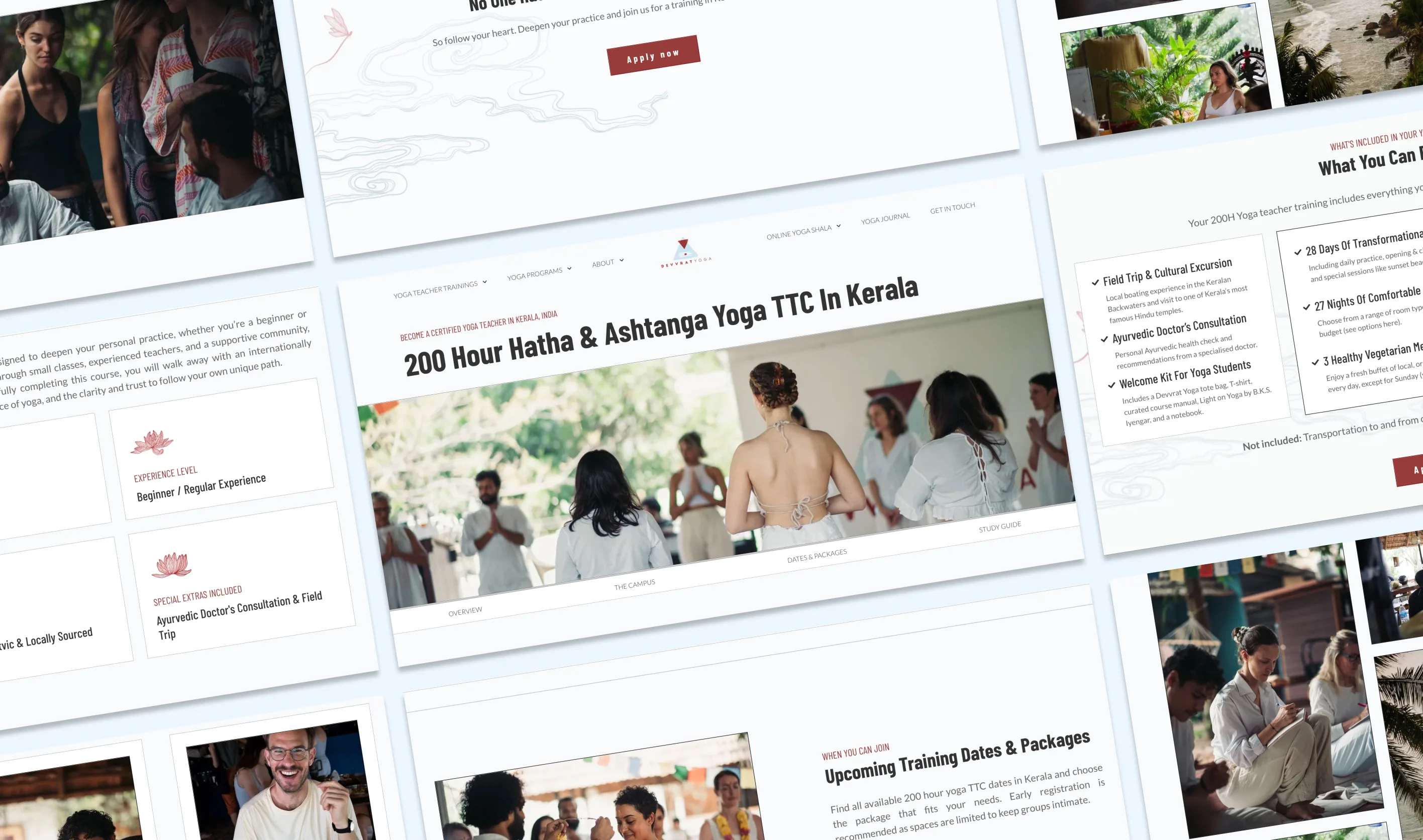
A leading yoga teacher-training school in India with 3000+ students needed a complete transformation of their digital presence.
Students book from thousands of kilometres away and commit to a month-long, high-investment training before ever visiting. That makes the website, the social feeds and the online reviews the only places trust can form. Every touchpoint was therefore treated as a trust touchpoint and held to one standard.
THE BIG QUESTION
With 30+ competitors within less than 15 km², how do you convince students on the other side of the world to commit to your month-long yoga teacher training?
THE APPROACH
Turn digital excellence into the school's competitive advantage: the one touchpoint of trust, made seamless from first click to check-in, that wins the students a competitor's website loses.
THE IMPACT
>600% increase in clicks
>500% increase in impressions
>36% increase in CTR

Authenticity and efficiency as differentiator
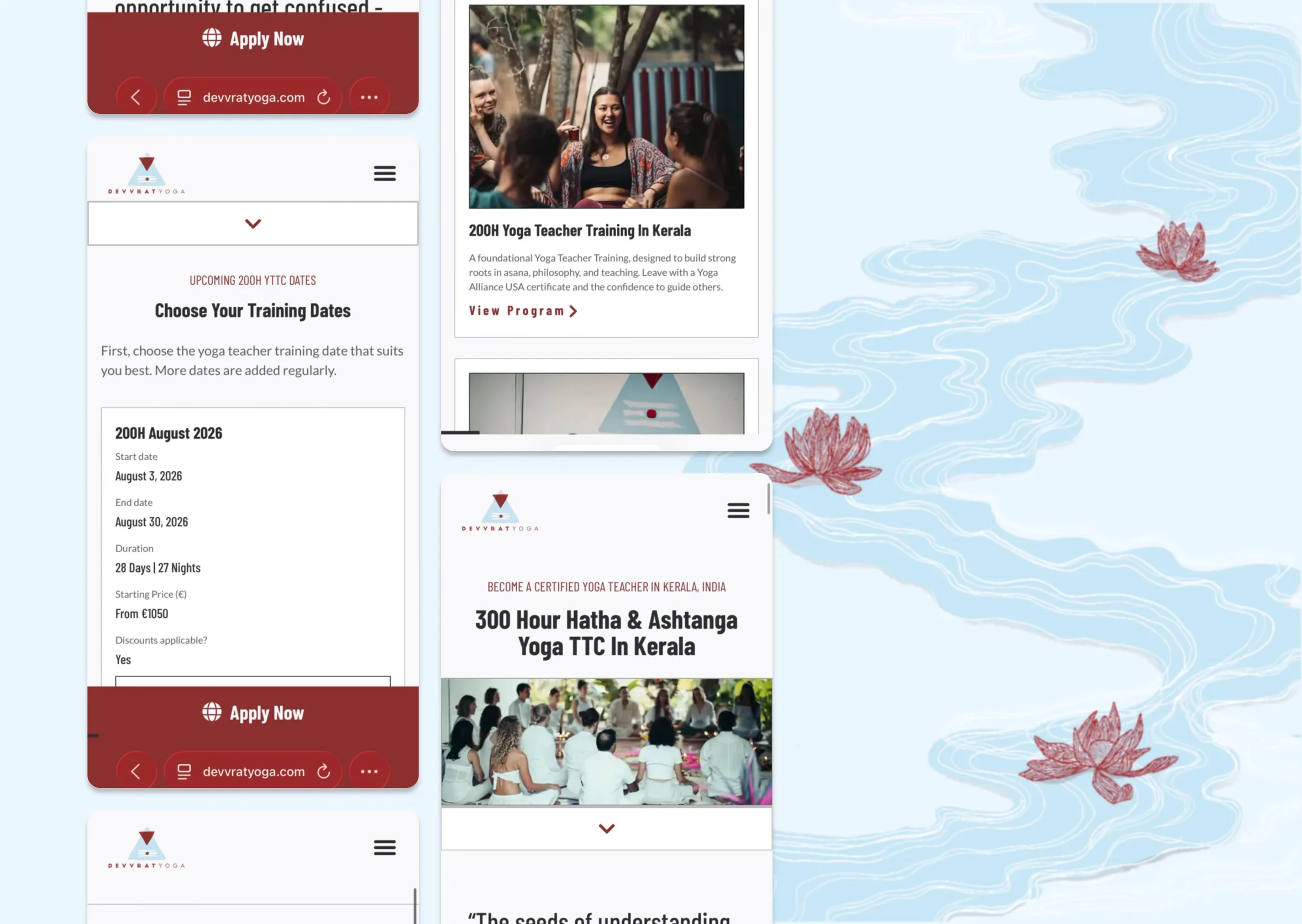
The competition was dense but its digital was not: more than 30 schools sit inside less than 15 km², yet most of their sites were poorly built and barely managed. Digital excellence itself became the differentiator, expressed through a serious, scientific, no-nonsense position and minimal hand-drawn illustration on a monotone palette. That set the school apart from rivals who were either aggressively commercial or heavily traditional, and claimed a quality none of them had.
As someone who has managed 5-star hotels in NYC, I was genuinely impressed by the digital experience, from the website to post-sales support, and it is one of the main reasons why I chose this school.
Educational & mobile-first
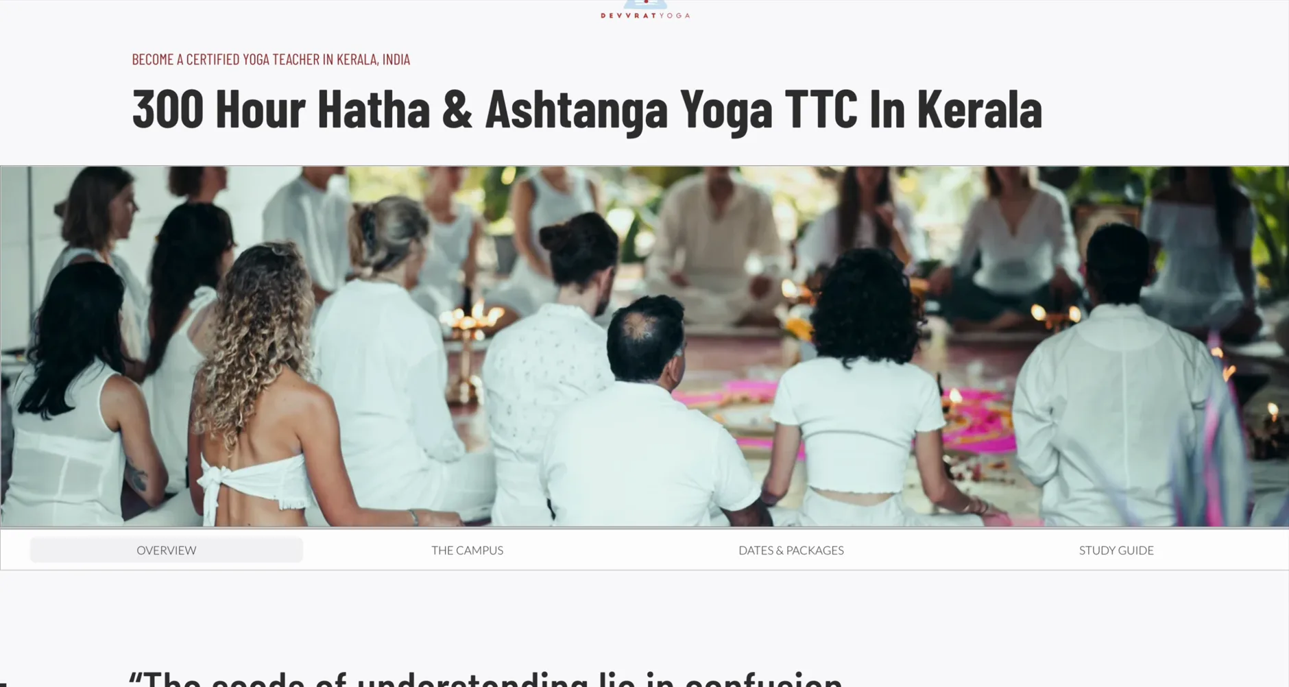
Prospects weigh several schools at once, on their phones, from another timezone, with 30+ programmes to make sense of. I rebuilt the sitemap the way university websites organise many courses, campuses and fees, giving each programme its own subpages for campus, dates and prices and study material, and designed the experience mobile-first since more than half of visitors were on phones. That let distant students self-serve and compare with confidence, and as a side effect lifted clicks per visit and search ranking.
Connected, from first click to check-in
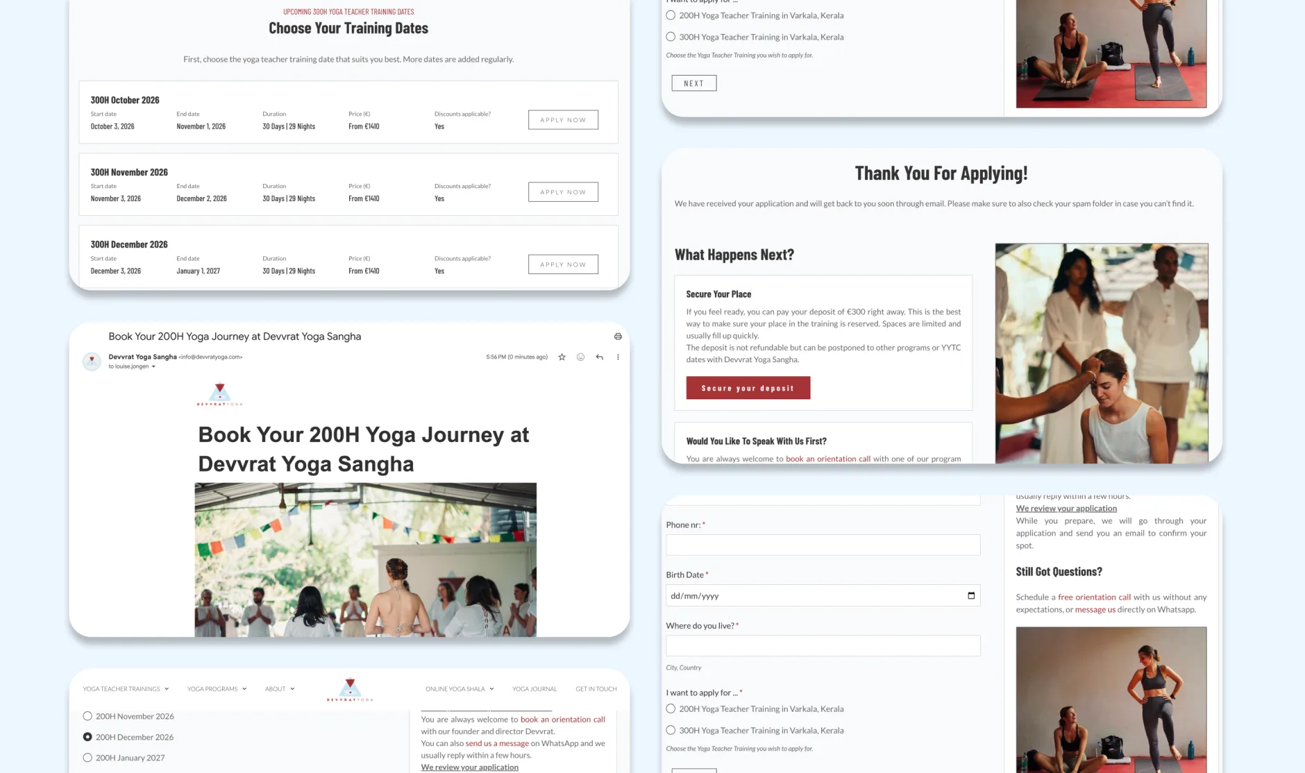
Behind the site, every step from application to check-in ran manually across 20+ programmes, producing errors and outdated information. A backend database and dynamic, conditional, multi-step forms replaced the manual process, wired to a handmade CRM tailored to the school's data and mapped to the full customer journey. The experience stayed accurate and consistent from first click to check-in.
Common Sense Robotics
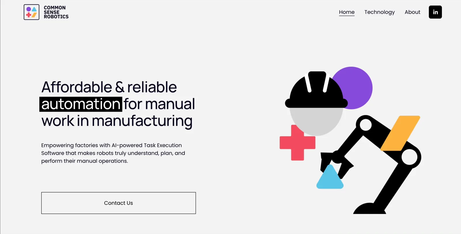
A pre-seed robotics and AI startup in Belgium needed a credible digital presence to attract funding, talent and partners.
Most of the work was with the founders: understanding the technology well enough to turn it into visuals they could use in their early pitches to investors and partners.
THE BIG QUESTION
How do you convey credibility to investors and partners for a technology that's not tangible yet, confidential, and extremely complex?
THE APPROACH
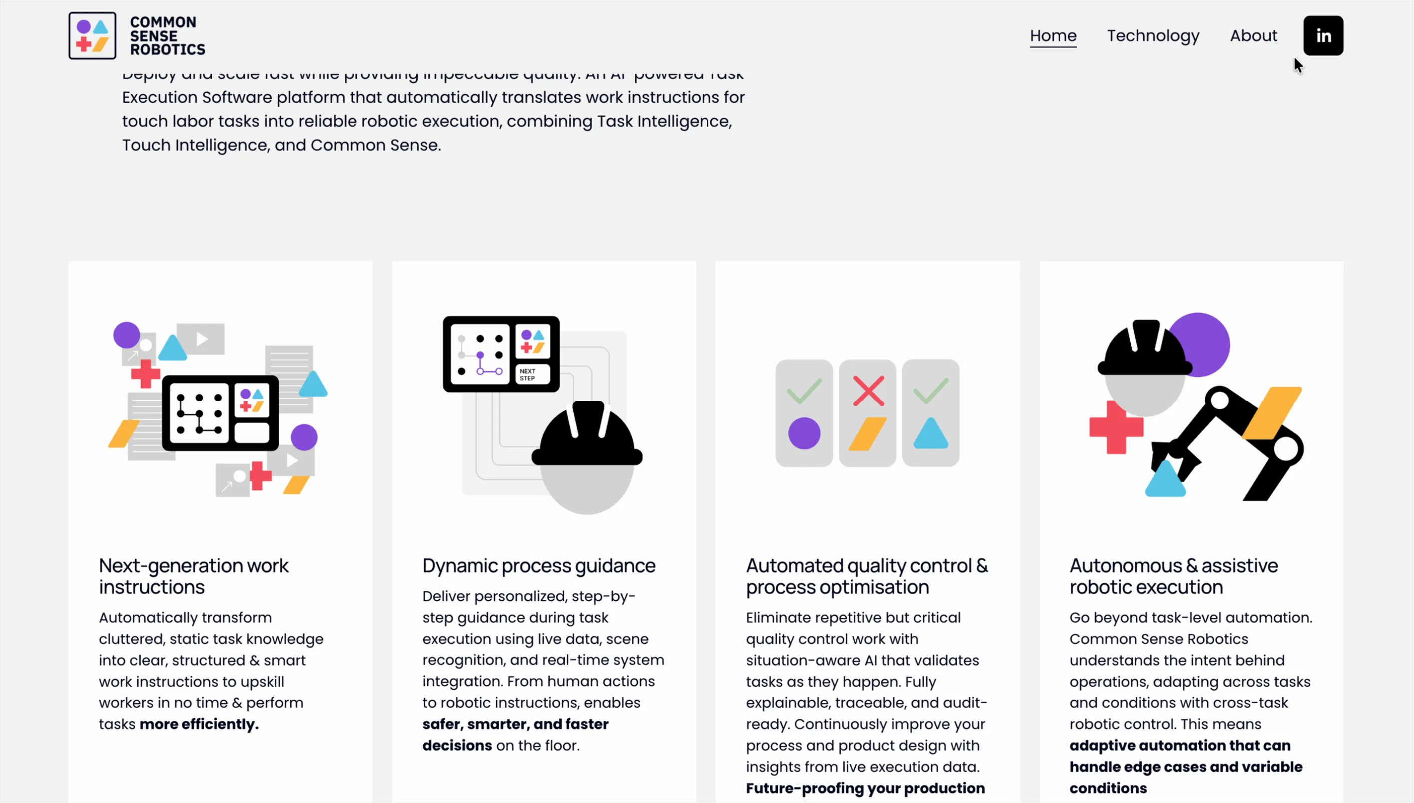
Visualise the technology through illustrations, lead with the why behind the technology, and build a structure that could be updated constantly.
THE IMPACT
Over €3M raised during the engagement, including from the European Commission.
Understanding the problem
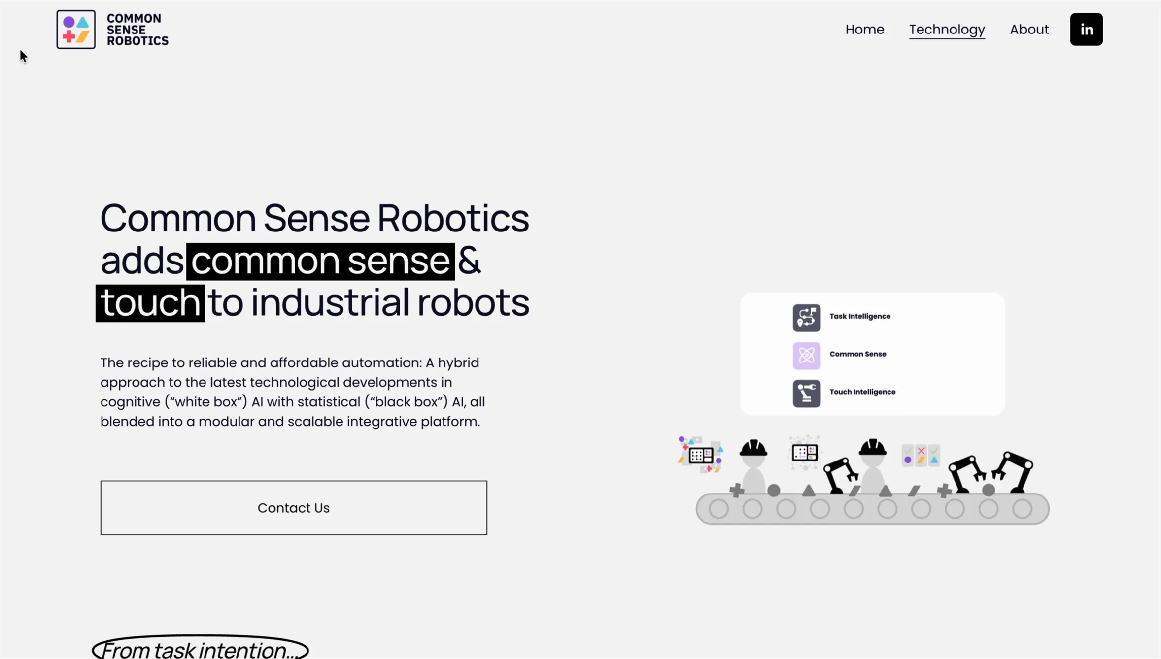
There's a saying that the solution lies in how well you understand the problem. CSR's technology is AI-driven software and architecture for robots used in manufacturing, hard to understand even for people in the industry. Before anything else, it was crucial to understand the actual problem the technology solved, and how it solved it. I spent most of this project working closely with the founders to understand the technology and shape the story we wanted to communicate, in their pitches and on the website.
Simple illustrations to explain complex technology
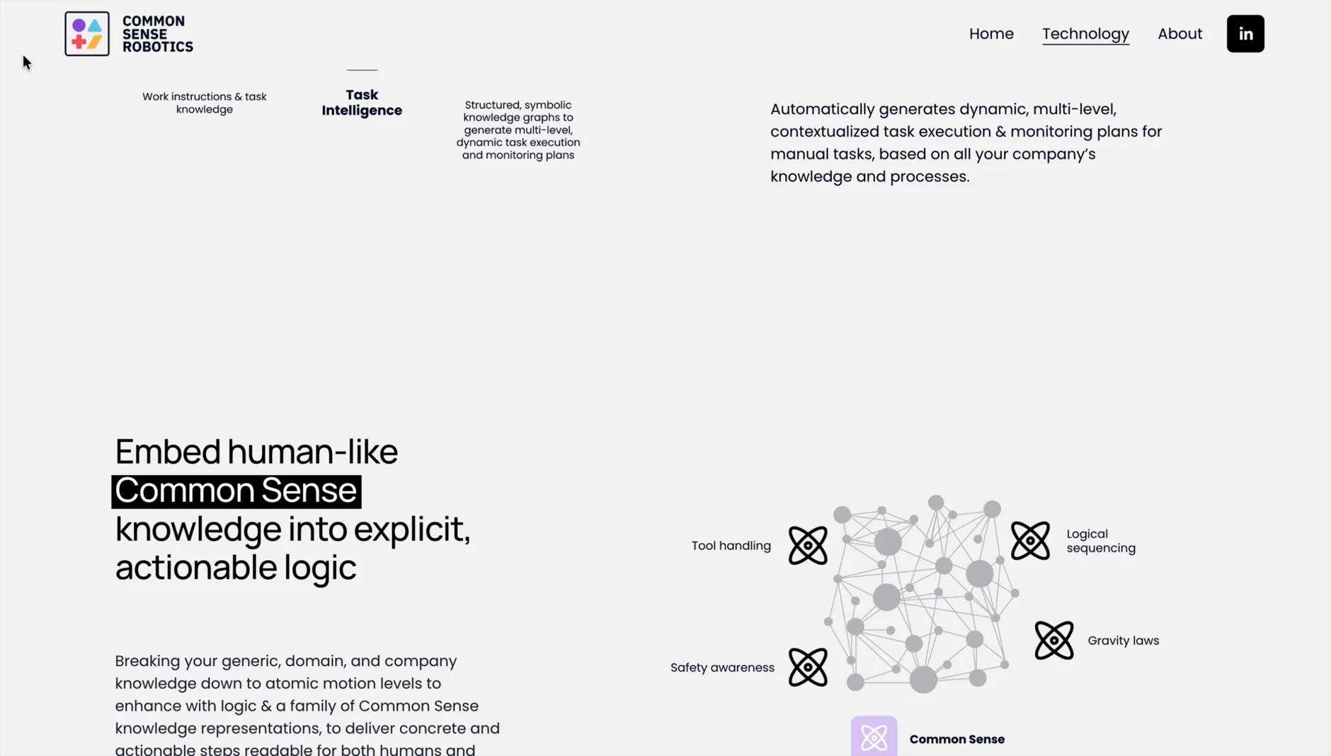
The product wasn't live yet, so there were no photos or renders to use. Combined with the complexity of the technology and the risk of oversharing IP and innovation, this created three separate problems. Illustration and visuals became the one solution that solved all three: showing the technology's value without needing a real product to photograph or technical detail to explain. Most of the illustrations were made for the pitches to investors and partners, and are not public.
Light structure for daily maintenance
The product changed almost by the day, so the website needed a structure that could keep up without a full rebuild each time. Content stayed high-level enough to remain accurate as the technology evolved, while still being easy for a two-person team to edit. Wireframing and prototyping shaped that structure, and Squarespace made it possible for non-technical team members to update the site quickly.
Metamorphose
An experiment
THE BIG QUESTION
How can we synergise hand-crafted art with the boundlessness of AI?

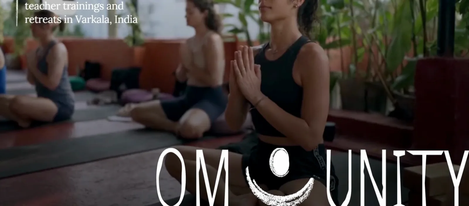
Omunity
A newly opened meditation school in India needed a clear branding that converts bookings, while keeping their ethos of integrity intact.
THE BIG QUESTION
How do you build a meditation brand that converts without being commercial?
THE APPROACH
Earn trust through clarity, subtlety and quality, on a system built to scale as the school grows.
THE IMPACT
Designed and built in one month, the full brand and website launched in March 2026, nearly a year ahead of the school's official opening in February 2027.

Clarity through facts & information
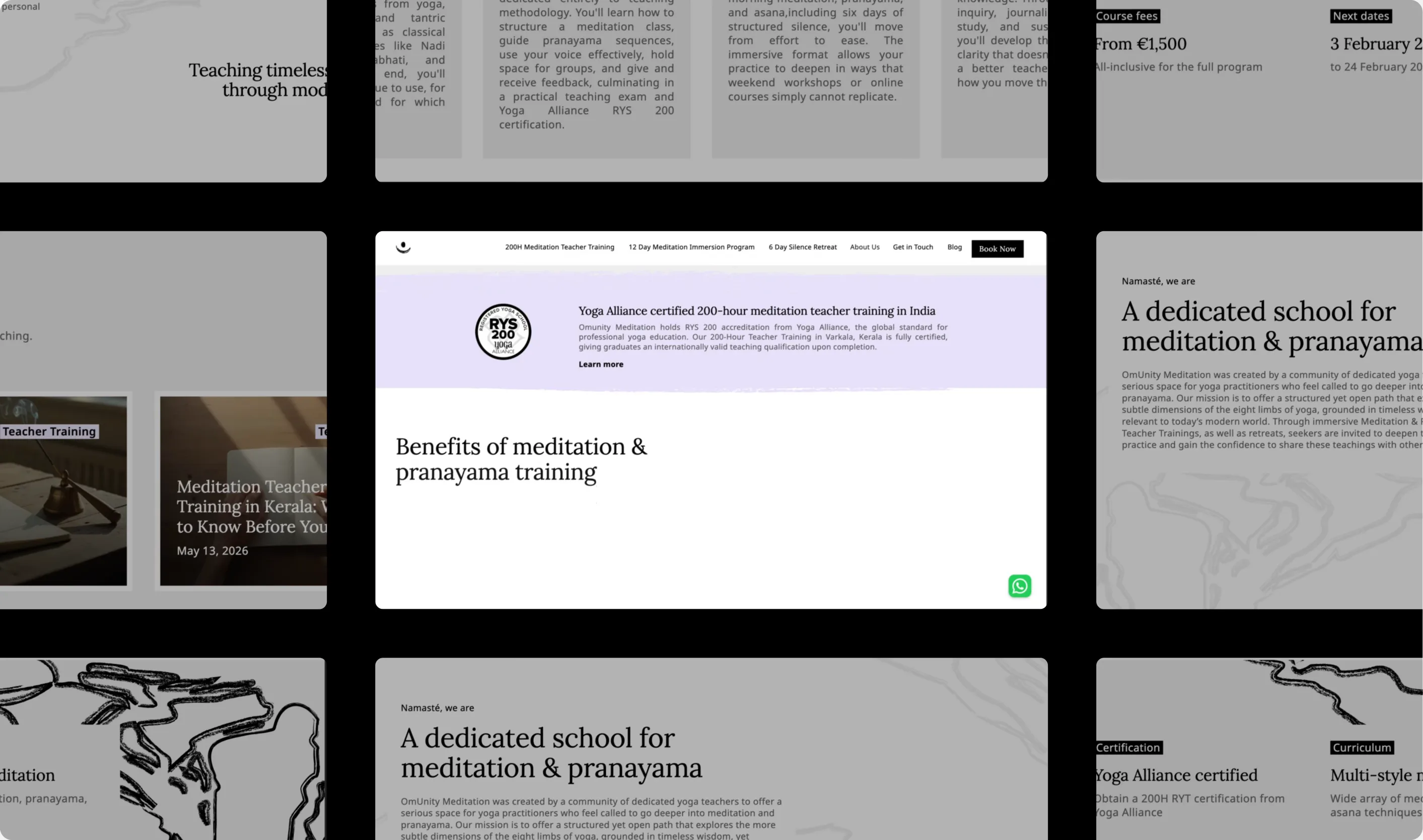
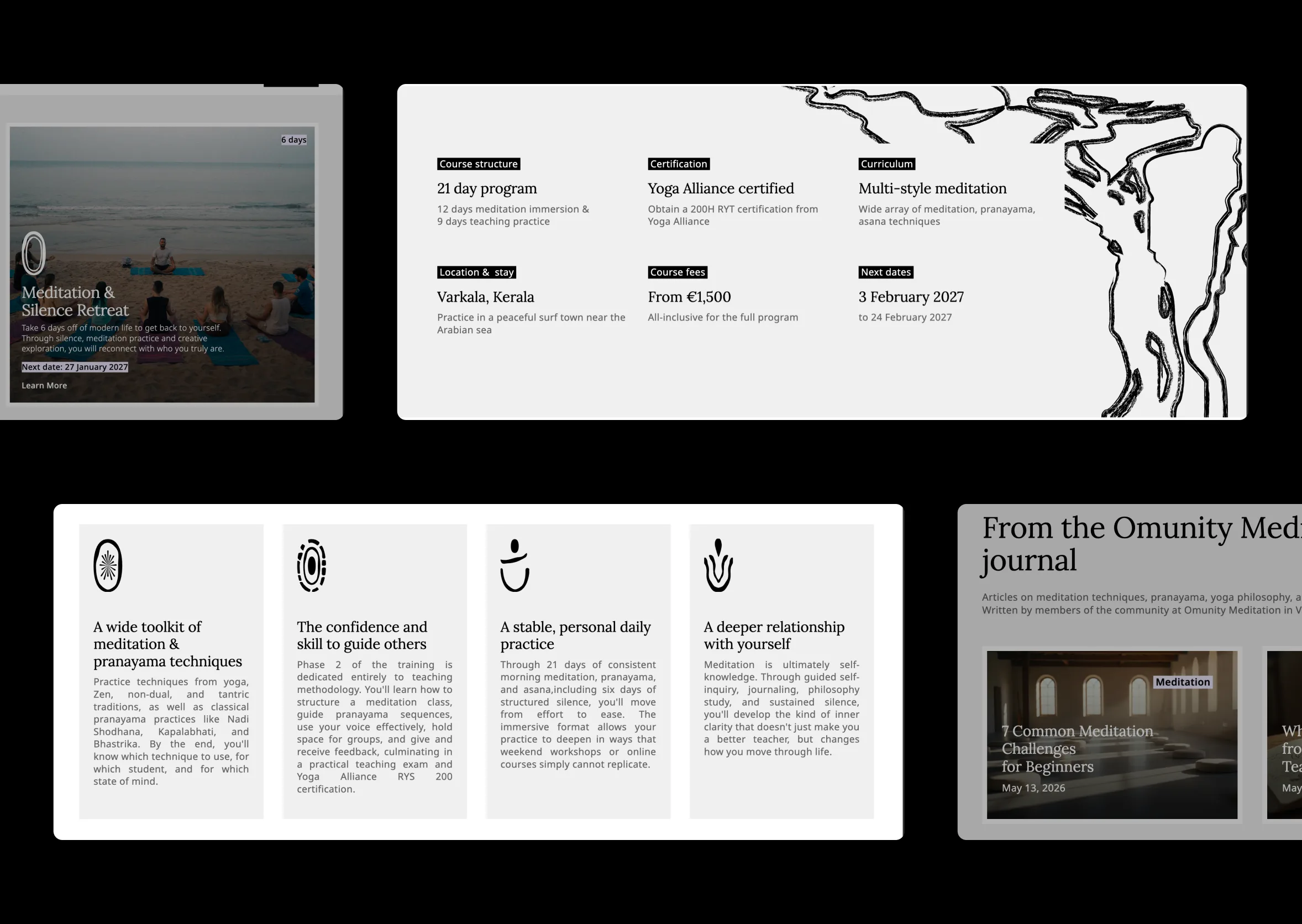
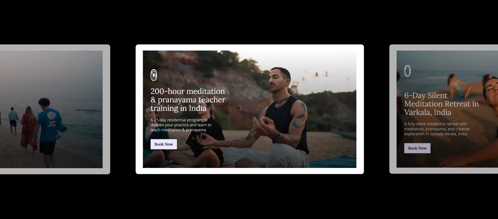
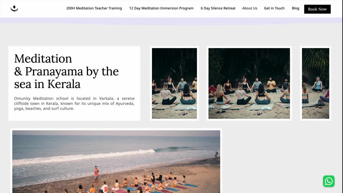
In order to build trust and reflect the philosophy of a modern meditation business, the website leads with clear facts, objective statements and detailed information, instead of inspiring copy. The challenge here was to include a lot of information, such as a detailed curriculum, philosophy, teacher backgrounds and logistics to convey the seriousness of the organisation, while keeping the user experience light, clear and with a set direction. For example, each program page opens on an overview, sits behind its own submenu, and closes on an FAQ specific to that program, and the curriculum itself was split into chapters instead of one continuous scroll.
A scalable and maintainable system for everyone
To support a large and changing set of programs, packages, pricing and dates, while keeping every page consistent and easy for the team to maintain themselves, the backend runs on Webflow and a single CMS and database, instead of one-off pages built by hand for every new program. Every program runs on the same page template, FAQ sections are built as filterable components rather than one-off blocks, and the CMS extends to accommodation, blog posts and program dates as well.
Subtle signals instead of a commercial push
One of the biggest challenges was to give visitors real proof and selling points, while never making any single page feel like it was trying to convince them. For example, the Yoga Alliance certification appears on every relevant page rather than only the homepage, reviews sit behind a subtle link instead of a testimonials wall, and visitors are asked to apply rather than book, which turns the first step into a conversation instead of a payment.
Reflecting quality through cinematic visuals and motion
To build credibility for a new school with no track record yet, the visual system leads with high-quality, cinematic imagery. Hand-drawn illustration and subtle GSAP motion carried every transition between chapters and sections, so the same visual system ran consistently from the homepage through to the densest inner pages.
Devvrat Yoga Sangha
A leading yoga teacher-training school in India with 3000+ students needed a complete transformation of their digital presence.
Students book from thousands of kilometres away and commit to a month-long, high-investment training before ever visiting. That makes the website, the social feeds and the online reviews the only places trust can form. Every touchpoint was therefore treated as a trust touchpoint and held to one standard.
THE BIG QUESTION
With 30+ competitors within less than 15 km², how do you convince students on the other side of the world to commit to your month-long yoga teacher training?
THE APPROACH
Turn digital excellence into the school's competitive advantage: the one touchpoint of trust, made seamless from first click to check-in, that wins the students a competitor's website loses.
THE IMPACT
>600% increase in clicks
>500% increase in impressions
>36% increase in CTR
Authenticity and efficiency as differentiator
The competition was dense but its digital was not: more than 30 schools sit inside less than 15 km², yet most of their sites were poorly built and barely managed. Digital excellence itself became the differentiator, expressed through a serious, scientific, no-nonsense position and minimal hand-drawn illustration on a monotone palette. That set the school apart from rivals who were either aggressively commercial or heavily traditional, and claimed a quality none of them had.
As someone who has managed 5-star hotels in NYC, I was genuinely impressed by the digital experience, from the website to post-sales support, and it is one of the main reasons why I chose this school.
Educational & mobile-first
Prospects weigh several schools at once, on their phones, from another timezone, with 30+ programmes to make sense of. I rebuilt the sitemap the way university websites organise many courses, campuses and fees, giving each programme its own subpages for campus, dates and prices and study material, and designed the experience mobile-first since more than half of visitors were on phones. That let distant students self-serve and compare with confidence, and as a side effect lifted clicks per visit and search ranking.
Connected, from first click to check-in
Behind the site, every step from application to check-in ran manually across 20+ programmes, producing errors and outdated information. A backend database and dynamic, conditional, multi-step forms replaced the manual process, wired to a handmade CRM tailored to the school's data and mapped to the full customer journey. The experience stayed accurate and consistent from first click to check-in.